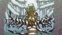
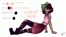
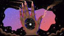
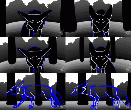
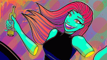
@Stanced contest entry
By Anadroj-C-E
Ok so here's my entry for @Stanced's color palette contest! I decided to take the liberty of lowering the opacity on multiple layers in order to get various saturations of the same 3 colors plus black and white. I know it might look like I used different colors/hues, but if you press play to watch the process you'll see how I made it look that way. Nonetheless this took me WAY longer to make than I anticipated, but I'm satisfied with the result lol. Anyway, hope yall and @Stanced like this!
This animation is a continuation of:- Published January 15, 2023, 13:55
- in Still Waters
- in Contest Drawings
- is not continuable by others
- 58 Views
- Favourited times
Comments 0
You gotta have an account (and be logged in) to add comments. I know: bummer, right?
![Color palette contest!! [DESC.]](/animations/j5ax70/preview.gif)
