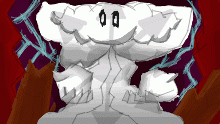
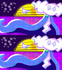
𝐂 𝐇 𝐀 𝐎 𝐒 (remake)
By RotorMoil
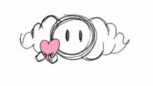
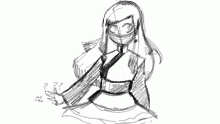
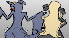
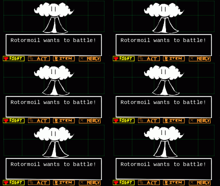
redraw of old thing. ,minus the weird design choices I made for Rotor back then. think my problem was going a bit too far with the effects, and making the colors blend together too much, mainly saying this because I think Rotor looks fine by himself https://drawn.digifi.ca/play/iqf4ga but with all the other random stuff in the background he doesn't become the main focus and makes the rest of the drawing hard to look at. The whole thing is also just very monochromatic. Besides that I'm pretty proud of this.
This animation is a continuation of:- Published August 02, 2021, 01:06
- in Still Waters
- in 2. Good? OC Art
- is not continuable by others
- 34 Views
- Favourited times
Comments 0
You gotta have an account (and be logged in) to add comments. I know: bummer, right?
