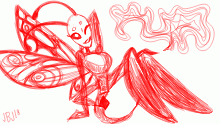
@sugr!kube color palette suggestion
By Anadroj-B-J
Here's a suggestion for changing the color palette! I think the main reason your dark/black wolf looked better was that it was a lot more simple in design and had better contrasting colors. Hope this helped give you a better idea on how you want to design the light/white wolf!
- Published March 31, 2020, 02:08
- in Kiddie Pool
- in continuations
- is not continuable by others
- 25 Views
- Favourited time
Comments 0
You gotta have an account (and be logged in) to add comments. I know: bummer, right?


