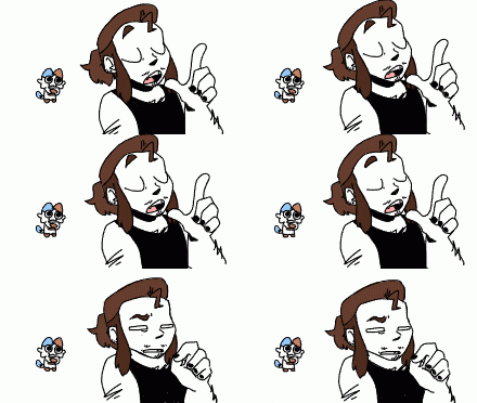
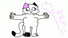
Contest Entry
By RaccoPunk
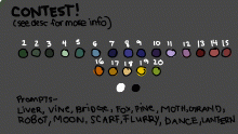
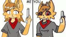
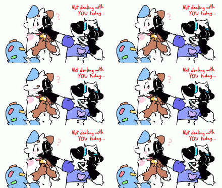
All colors from the contest, shading and lighting are black and white with lowered opacities :) also some colors were adjusted using the same strategy (example the scarf is lighter thanks to lowered opacity white) I love this!!!!! #conceptchallenge @sonia
This animation is a continuation of:- Published February 18, 2021, 16:47
- in Still Waters
- in Old garbage
- is continuable by others
- 23 Views
- Favourited times
Comments 0
You gotta have an account (and be logged in) to add comments. I know: bummer, right?
